
ScribePay
Reinventing how you pay, manage and cancel subscriptions with ScribePay

Project Brief
Background - Working as the only Designer in the team, I designed and prototyped the first version of a subscription service platform for a London-based Fin-tech startup. I iterated the product structure and refined several versions of the design. As planned, the app will launch in September 2021.
Role – UI/UX Designer
Skills & Tools – User Research, Ideation, Prototyping, Adobe XD
Team - Delphine Emenyonu (Director), Ikenna Emenyonu (PM) and Stanley J. Cantrell (UX Researcher)
Timeline - 3 month
Problem
The current way is flawed and people have limited control over their subscription
The idea of ScribePay was inspired after the founders had trouble with the subscription 'trap' and questioned that there has to be a better way to manage subscription content. With the limited current options available, ScribePay was started as the 'one-stop place to manage subscriptions.
Solution
ScribePay is an all-in-one app to help users pay, manage and cancel subscriptions, making it easier to keep on top of payments.
The mission is to give users control, visibility, and peace of mind over the payments they make online. My responsibilities included helping with user research, creating wireframes, and developing the mobile application prototype.
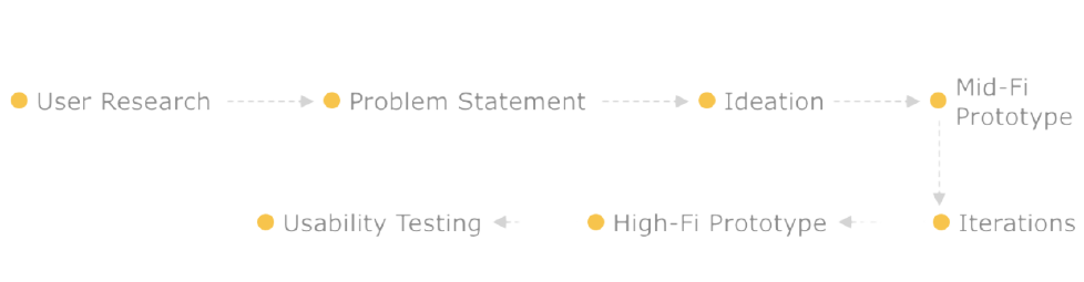
Process
Discover, Define, Design, and Deliver
First, we conducted user research as part of the HCD process. We identified the issue and jumped straight into the ideation process after synthesising inspiring perspectives from the survey and interviews. We designed the first version of the app in stages, starting with sketches and progressing to fidelity prototypes. We're currently conducting usability tests and will iterate further based on the results.
Research
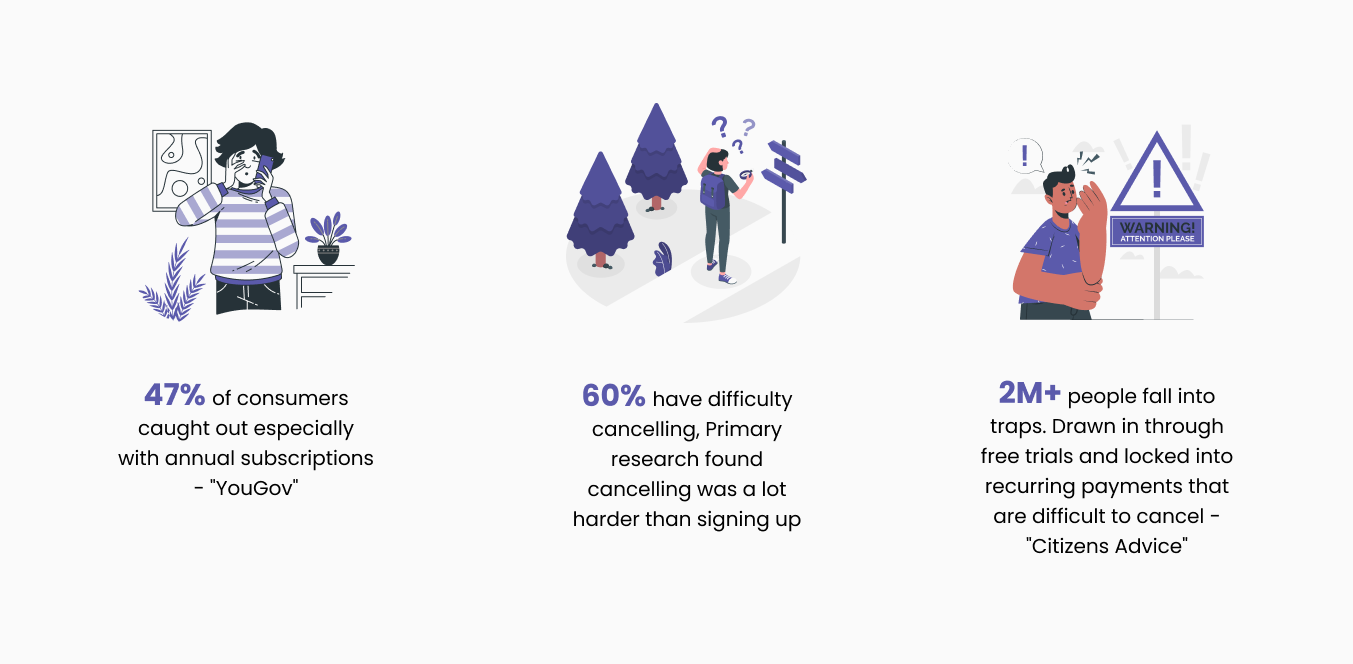
Spending towards subscriptions is increasing and action is needed to fix loss on unwanted subscriptions.
According to secondary research, 5% of monthly spending goes towards subscriptions. This is expected to grow by 30% annually and someone needs to fix the flaw. The market for subscription management applications provides a basic visual of subscriptions and doesn't focus on the bigger problem of being able to cancel subscriptions. Primary research found cancelling was a lot harder than signing up.
However, the current market doesn't have a product that provides the service of managing subscriptions and also acts as a digital wallet to cancel/pay subscriptions.
Therefore, I downloaded top-rated digital banking apps along with a subscription management app. I then conducted an S.W.C.D.UX.O Analysis which is an enhanced version of SWOT Analysis focused more on UX design. The analysis provided me with inspiration for the ScribePay app and also gave me an understanding of the strengths and weaknesses of those apps in terms of visuals and UX. See the full analysis.
Ideation and Analysis
User Stories
A User Stories was developed to provide a simplified overview of a mobile app functionality requirement and to ensure that all of the features are from the viewpoint of the end-user. See the full document User Stories.
Site Map
I then created a visual site map to show the information architecture of the app. It provided a visual representation of the app and how different sections are linked together. By creating a site map I confirmed with my PM whether the app is heading in the correct direction and the team can also understand what content is needed in the app to meet the goal.

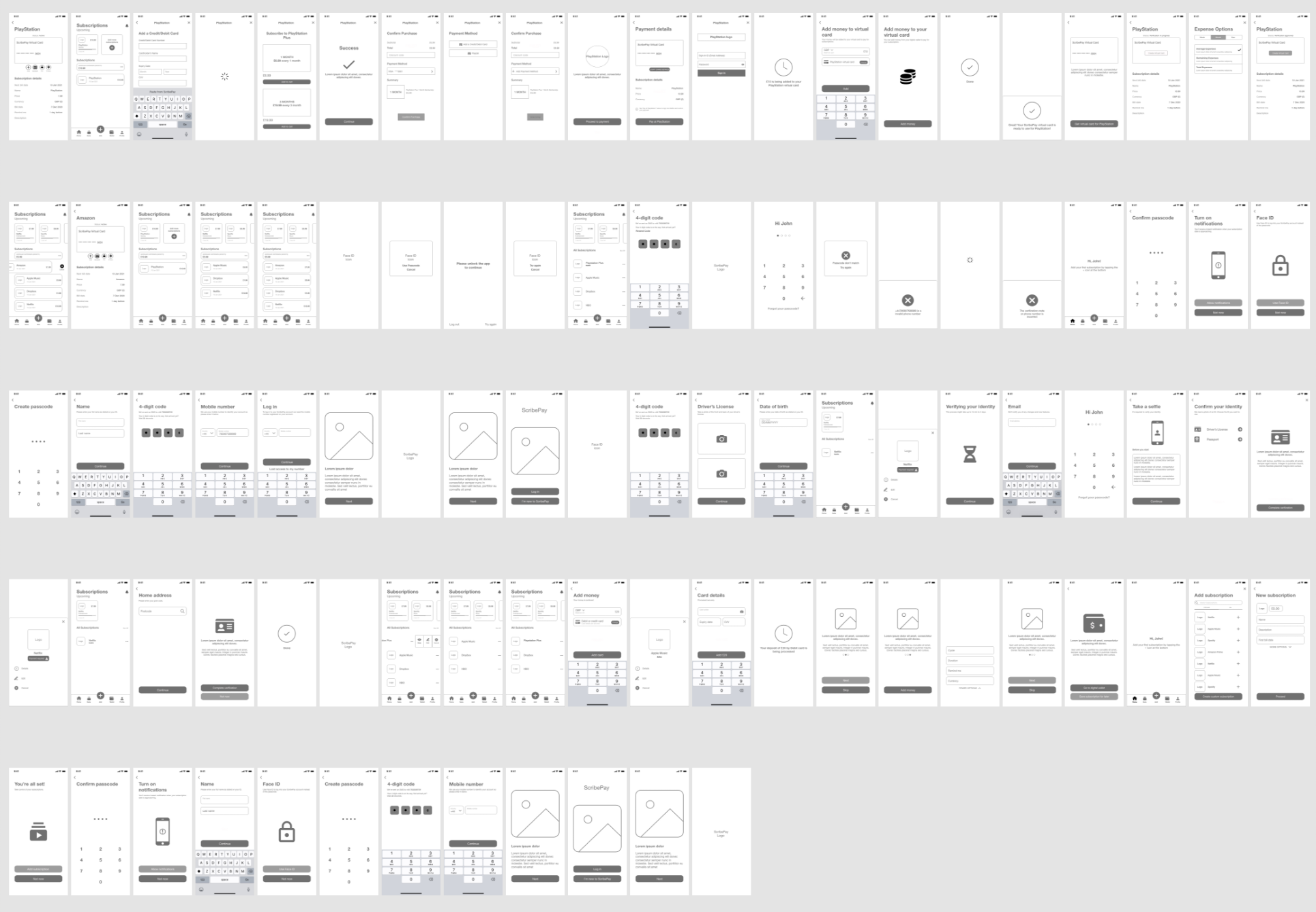
Wireframes
Based on the information architecture, I moved to ideation by first creating some rough sketches and then moved on to wireframes
Design Goals
How might we help make the process of cancelling subscriptions easy and provide an alternative way to pay for subscriptions?
Based on the research, there isn't a product in the market which offers the users full control of their subscriptions from managing, cancelling and paying. Currently, people are looking to identify their unwanted subscriptions and cancel them without having to go through a long process.
Design Problems
Two major UX problems to tackle
Based on the design goals, I received an information architecture generated by my Product Manager. I found two outstanding design problems waiting for me to tackle.
The onboarding experience was too long and required information from users which I believe was not needed in the onboarding.
The unique selling point (USP) of the app is the swipe to cancel the subscription. However, just swiping is not enough to cancel a subscription both from the technology and UX aspect. I needed to find an optimal way to incorporate swiping interaction in the process of cancelling subscriptions.
Prototype
Design Decisions
#1 The onboarding experience
The main focus of ScribePay is the subscriptions but it is also the digital wallet that can be used to pay for subscriptions. Due to this, personal information and verification are required from the users to access the financial side of the app. The original design flow from my product manager included a long registration process that required asking the users for their personal details.
I proposed the solution to remove asking information that we would not need from the users at this phase such as the user's date of birth, address and ID verification. I opted for this approach since ScribePay is a new app that the users are not familiar and therefore asking for private information straight from the start can put them off using the app. Personal information can be collected when the users decide they want to use ScribePay to pay for subscriptions. Another reason was users might simply want to manage all their existing subscriptions and not actually pay or cancel subscriptions. This decision helped the onboarding experience to be quick yet informative.

New user onboarding journey
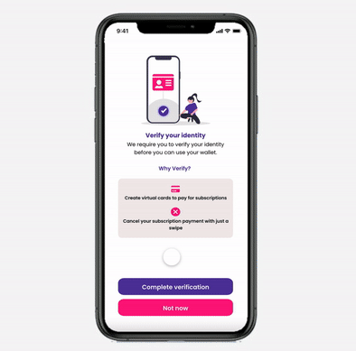
User verification journey (includes requesting personal information that was removed from the onboarding journey)
#2 "Swipe" to cancel subscriptions
With the design goal of making cancelling subscriptions a very quick and efficient process. Initially, I added a swipe interaction on the subscription which would display the cancel icon and once the user presses cancel, a pop-up modal will ask for confirmation. Then I realised after testing with some people that while it did make the process of cancelling quick, people felt very unsure after cancelling and weren't sure if their subscriptions had been successfully cancelled.
To solve that uncertainty, I decided to add a screen that would ask the users for confirmation and after discussing with my PM we decided to also include a text box asking users for their reasons for cancelling. This can be then sent to the subscription company which can valuable information for them. I then added a loading animation which would provide the users with confirmation of their cancellation.

Cancel Subscription Flow
MVP Showcase
Pursuing the perfect craftsmanship
By the end of the two-month project, I delivered the design specs of the first version product. PM and researchers are conducting usability tests and we will iterate based on the feedback we receive.
Reflection
Early-stage product = more flexibility but the heavier workload
It was the very first time for me to work as the only designer in a startup team. I was able to have more space and flexibility to explore design options and user interactions but I also needed to mock up every single screen for development. Although it was tons of work, I practised designing flows that are usually ignored in short-term university projects, such as onboarding, account settings, and profile setup flows. I've gained a holistic view of a mobile application in terms of end-to-end experience and product strategies.
Internal communications drove the project
This was also the first time for me to directly communicate with researchers and PM. With PM, however, I spent quite an amount of time discussing and reviewing both visual and interaction designs. I learned how to effectively convey my rationale and justify the design during the discussions back and forth, and I also realised that efficient and open internal communications would motivate the teammates and drive the entire project going in a better direction.