
Project Brief
Background - Create a smart wallet system that will provide users who have lost or had their wallets stolen with an efficient and stress-free experience.
Role – UX Designer
Skills & Tools – User Research, Ideation, Prototyping, Usability Testing
Team - Me, Edidiong Iton, Jyronne Pruis
Timeline - 3 months
Problem
Why is a smart wallet needed?
The experience of finding lost wallets and the process of cancelling bank cards is very stressful if it’s not a smart wallet.
The main focus is on the issue of lost wallet whether it is misplaced inside the house or stolen. These issues can have a negative effect both physically and mentally. Physically the users will have to cancel their bank cards whether it's via phone call or going to the bank, reapplying for a driver's license etc. Mentally, loss of wallet can cause a lot of stress for people as it means having to retrace all the steps in their mind and the fear of it being stolen.

Here comes the design challenge:
How can we help the users overcome these barriers and create a more efficient solution to prevent losing a wallet and provide a stress-free experience with the help of information technology?
Research and Findings
Through secondary research and interviews, I gained an understanding of the target users’ problems and experiences when it came to their loss of wallet. 3 university students who have experienced losing their wallets were selected for the interview.
Interview findings
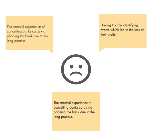
Three major barriers users encounter when they lost their wallet

The result of the survey gave us a better insight into our targeted users and their lifestyles such as if they own a wallet and if they do what they carry in their wallet or how many bank cards they own. The survey result concluded that 98% of the respondents do their own wallets and they carry bank cards which shows that our system is appeal to users.
The important findings that will impact future design include:
A wallet is owned by the majority of people and the bank card is the most popular item in their wallet.
People's first reaction to the loss of their bank card is to call the bank to freeze or cancel their card.
Emotionally people were fine as long as they can cancel their cards.
Therefore it makes sense to focus on proving the user with a smart wallet that can physically hold bank cards but also design a mobile app, with features to track wallet and freeze bank cards quickly.
Persona
Through the data we received from the survey and interview, we were able to identify our customers and create a realistic representation of key audience segments through user personas. 4 personas were created with real people ranging from different ages within our target audience of 18-35, all from different backgrounds ranging from students to business analysts. With each persona having different goals and values, this allowed us to generate new feature ideas and uncover different functionality needed for our system in order to cater to the users’ needs and goals.


Competitive Analysis
In order to understand the current market of smart wallets, we conducted a competitive analysis of features among competitors’ products. We found 2 direct competitors offering a similar product to ours, Tile and Woolet.

Competitive analysis of our top two competitors features
Through the analysis, we can find out how we can compete in the market and also create customer value which will differentiate our product from the others. The SWART app includes an SOS feature that will cancel or freeze cards with one click which is our unique selling point (USP) as shown through the competitive audit. This also contributes towards creating our value proposition which is that we will cancel your card in one go and track your wallet.
Ideation
Task Analysis
Task analysis was conducted to determine the crucial user goals in the app and the number of steps (or tasks) that a user must complete to get to the objective. The task and user analysis need to be considered to make sure the task the user will carry out and how those tasks will help meet the user goals. An example of this is shown below.

Task analysis for cancelling card
User Flows
User flows were created to display the complete path a user takes when using our product. The user flow lays out the user's movement through the product, mapping out each and every step the user takes—from the entry point right through to the final interaction

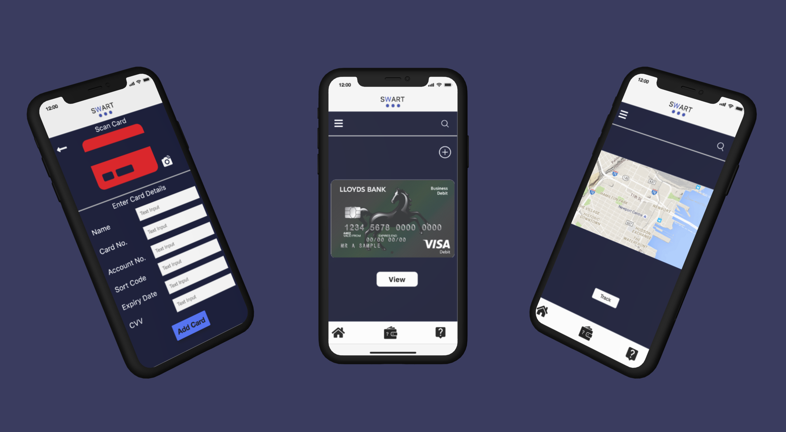
Prototype
Final Designs

Usability Testing
To test the SWART website and mobile app, TOBII, an eye-tracking device was used to record the participant's eye movements while they were using our prototypes. The test included, the participants using the clickable prototype to go through basic tasks The test was recorded with consent from participants, information such as the participant's behaviour, emotions, and responses that occurred throughout the test process. The concurrent Think Aloud (CTA) technique was used to keep the users thinking aloud to understand their thoughts while interacting with our system.
Test plan
Before the test, we planned out predefined benchmark metrics such as how much time will be required to complete the tasks and also how many steps it should take to complete the task. This is then later used as a reference point when we are comparing the user’s actual results. Here is a google doc link to the full test design.
Findings
For the most part, the test results match the benchmarks we created and follow the expected time required to complete each task. However, in some tasks, the participants took longer than we expected. For example, in task 5 participant two struggled to find the wallet finder feature and took a long time to complete the task. This may be due to the poor design of the wallet finder icon. The issue encountered is evident in the gaze plot image below.

Gaze plot for participant number two

Heat map results
Reflection
This was our first proper project and exposure to UX Design, we started the journey with an awkward meetup among 3 strangers, to a strong, motivated team who went on to form a team for a hackathon later on. For this project itself, due to the timeframe, we focused less on the user interface and more so on the interaction. For future consideration, I would like to focus on creating a better user interface for the product.